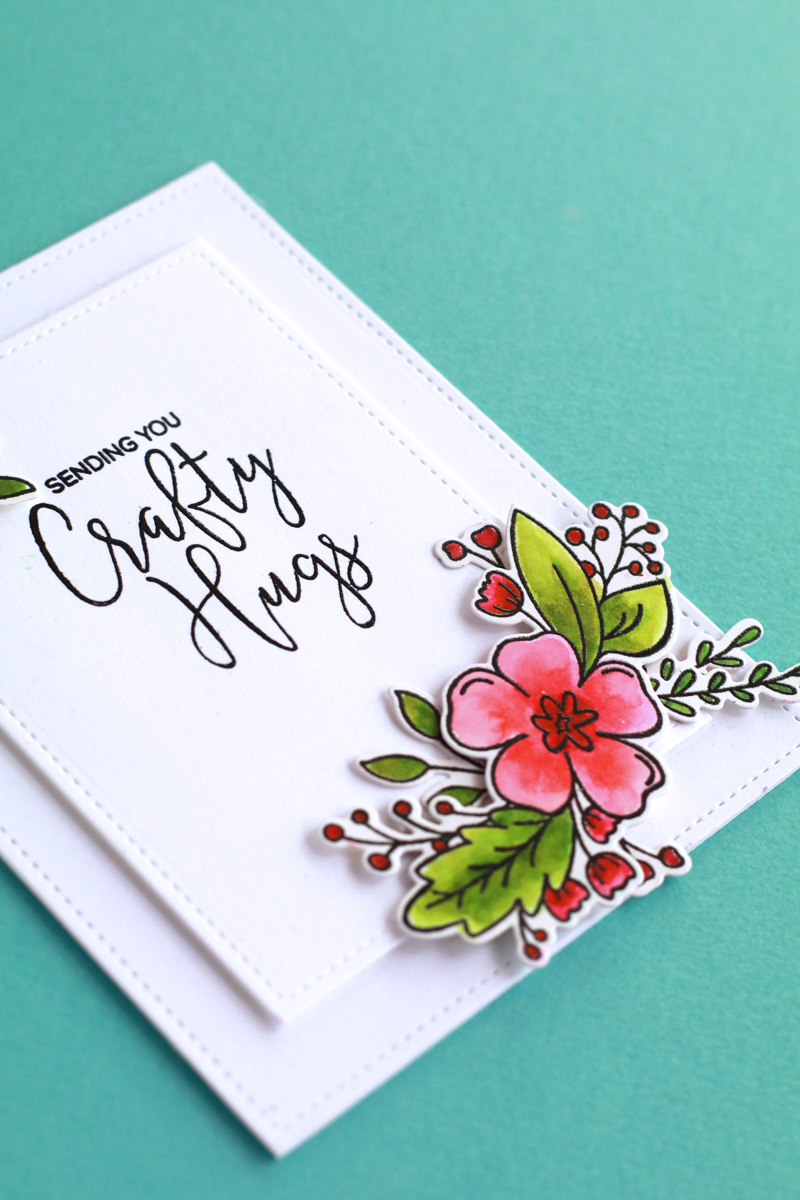
ZIG CLEAN COLOR Real Brush Pen というカード作りの世界でとても人気の水彩筆ペンを使って、カードを作ってみました。60色買ったのに、少し遊んでみた以外使っていないのです。紙は Bristol というこのペンに最適と言われている紙を使いましたが、使ってみた感想は、確かにスムーズに伸びて簡単に色を混ぜることが出来るのですが、あまり水彩っぽい仕上がりにはならなかったですし、色が鮮やかすぎて(その鮮やかさを好む方が多いようなのですが)あまり好きな感じではなかったです。カットしてカードにしたらそれなりにはなりましたが。。。
I made a card using “ZIG CLEAN COLOR Real Brush Pen”, which is currently very popular in the card making world. I bought 60 pen set but haven’t used it for cards other than playing with them a little. I used Bristol paper, which is supposed to be the best for these pens. I do agree that it’s very easy to paint with these but I personally don’t feel it looks very watercolour-like and also the colours are, to me, much too bright. I know many people like them BECAUSE the colours are bright but somehow I don’t love it. I’m happy enough once I cut the images and made them into a card but I didn’t love the result of the watercoloured images.
Versafine の黒でスタンプを押して透明のパウダーでヒートエンボスし、メッセージも同じインクでスタンプをして透明パウダーでヒートエンボスしているので、黒のラインは少し盛り上がって艶があります。こうするとインクや絵の具が外に流れにくいので、色を塗りやすいようです。
I stamped the images with black Versafine ink and heat embossed with clear powder, I did the same for the sentiment, so all the black lines are raised and shiny. When you do this to the images, it’s easier to colour because the pigments don’t easily go outside the lines.
参考にしたのは、こちらのビデオです。この方はもっとお水でぼかしておられて、その方が水彩っぽくなるのでわたしも最初はそのやり方で塗ってみたのですが、あまり良い感じに仕上がらなかったので色を濃いめにしてみました。
This inspiration is from Cathy Zielske’s this card. She uses more water to make it look more watercolour looking and I did try that first but I didn’t like the result so I used more pigment and less water.


Very pretty!!!!